Wednesday, September 19, 2012

Family Reunion Clock Design

I have been around long enough to remember a time when there was no internet. (Yes, 35 is still reasonably young.) Seems like only yesterday that my father's computer slowly dialed up a phone number beeping and spurting fax machine like noises as it attempted to connect up to an email service called Prodigy. Once connected, we got to send notes to my Aunt and Uncle's family in California, also known as the only other people we knew who had this service.

Since then the world wide web has grown into a never ending galaxy of connections. It is a major component in our everyday lives. At any given moment, we can simply google what we are looking for and through a moderate amount of searching, find just the right thing.

Never before in my life did I truly feel the power of this tool then when Kerrenda Crandol of North Carolina emailed me out of the blue for a design request. Her note inquired about whether or not I still designed custom clock faces. At first, I thought it was spam, but sure enough she had found the picture of the clock I did for the Fasanos back in 2009 and it was just the style she was looking for. And all she did to find me was put "custom clockface designs" into a google search - Amazing!

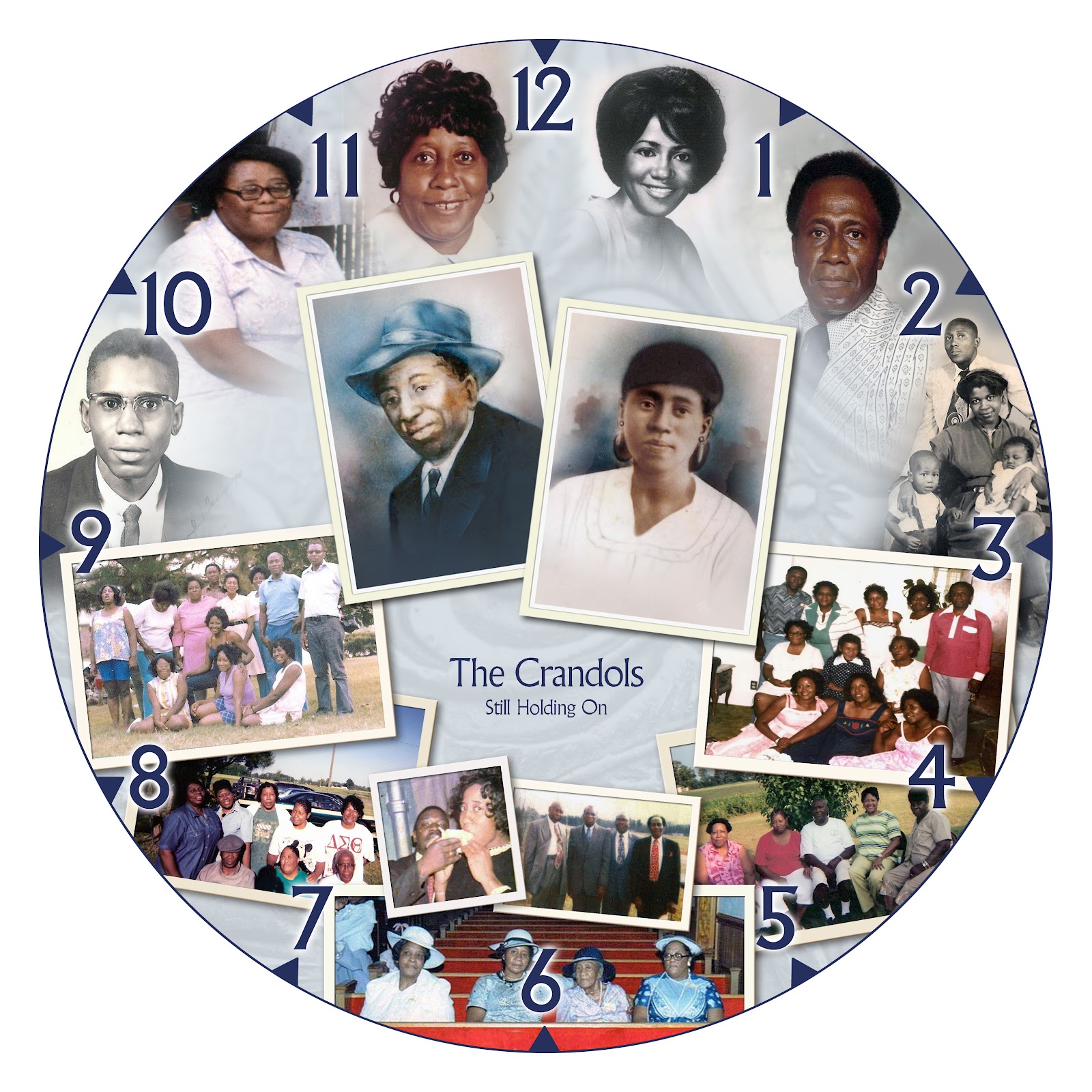
Every year, Kerrenda's family has a big reunion. Her grandfather is one of twelve children and every year, the younger generation presents the older generation with a gift. This year, Kerrenda was in charge of the project. She sent me a bunch of family pictures from over the years and she liked the blending techniques I used on the other clock. The only text we added was the family name and the tagline that they used every year at their reunions: Still Holding On.

ROUND 1, VERSION 1


Since we had a mixture of group shots and heads, I fit the larger head shots inside the spaces between the numbers first.  For the other images, I chose to create scattered pictures across the bottom half of the clock face. The primary pictures featured at the center, were family members that she wanted to have prominence in the layout so they have a slightly different frame style then the rest. The way the pictures scatter have a nice way of framing the rest of the circle and create a space for the copy, “The Crandols: Still Holding On”.

ROUND 1, VERSION 2

In this version, I wanted to try something a little different. Since this gift is for a reunion, it gave me the idea of a wall of framed pictures. The two feature photographs are still in the middle while showcasing the other supporting images in decorative frames. I also tried simplifying the clock face by only featuring the 12, 3, 6 and 9.  I was hoping this layout would help show the generations of family, over the years, without looking old-fashioned.

ROUND 2

In the next round, Kerrenda liked the way the headshots were fitting into the spaces between the numbers, so she sent me more shots of the rest of the family and we decided to do the whole clock face this way. I did two different versions with minor variations.


During this round, I also did significant retouching to many of the headshots. Some of these shots were from the 40s and 50s and had some bad cracks and creases in them. I did my best to bring them back to life.


Kerrenda chose version #2 and with some minor changes we arrived at the final clock face design.


It was truly a pleasure to work on this project. It really made me feel like I had a brief window into this family's rich history. I hope they will enjoy their clocks for years to come.

Tuesday, December 8, 2009

New Year's Eve Party E-vite

For the past four years, I have designed a New Year's Eve Party e-vite for Jeff, a friend and colleague. This "e-vite" is basically a JPG image with all the info that he can attach to an email in order to get the word out. Known for going all out with their parties, every year Jeff gives me the theme and I try to come up with something appropriate to match. For the guests, it's a lot more fun to receive a designed invite attached to your e-mail, then a black and white bulleted list of the what, when, where and how.

In the past, the themes have ranged from masquerade ball to a redneck New Year's. Every year, they are a challenge to come up with some original and fun. I truly look forward to this project. And this year's theme: DISCO!!

I provided two versions:

1. In this vector based version, I used solid shapes, rays, stars and a silhouette of dancers typical of 70s disco artwork. I kept the color palette simple, yet bright. I also provided an alternate option of this version using an orange color palette, just in case the he didn't like the pink.


2. In this version, I used the iconic disco ball as the focus of the e-vite. Letting the image speak for itself, I kept it simple by only adding the words "DISCO FEVER" wrapped around the curvature of the ball. This darker composition gave the feel of a sophisticated night club with a 70s twist.


Jeff liked Version 1, but in the alternate orange color palette. But he also liked the use of the disco ball, especially because they planned on decorating their house with a bunch of them for the party. He requested that I find some way to incorporate the disco ball into this version.

With the disco ball added and a few minor copy revisions, we had our final e-vite:


Thanks again, Jeff! I hope you all have a groovy New Year's Bash!!

If you would like to learn more about e-vite design, please post or email me at kathy@katandmousedesign.com. Ask about e-vites with interactive hyperlinks!

Tuesday, December 1, 2009

Custom Clock Face Design

I recently had the honor to help a friend and colleague create a very special gift for her father. After celebrating his 60th birthday this past August, her sister and she came up with an idea for a belated gift to surprise him with, just in time for Thanksgiving. They purchased a handsome circular wall clock with a wooden frame and asked if I would help redesign the clock face. She had seen pieces I had done before, like this image of my husband and I sitting on his old truck blended with an image of the beach from our St. John honeymoon.

She really liked this effect of blending the images together and wanted to achieve a similar effect with old family photos. I scanned in all the photos and began to work on montaging the pieces together like a puzzle. I started out using the original clock face design as a template, just to get an idea where the numbers and clock hands would fall.

The clock numbers on the original face were very large and the composition was starting to get a little busy. I knew I would have to redesign the entire face to incorporate smaller numbers so that the images wouldn't be obscured but the piece still functioned as a readable clock.

With smaller numbers and a simpler font, the clock face was already looking cleaner, but I was still concerned that the images weren't blending together as well as I would like. Many of the older shots had the subject of the picture too close to the edge of the image, not leaving very much material to blend into the next image. Always wanting to give my clients more than one option to choose from, I decided to try another idea:


In this layout, I flooded the majority of the clock face with a sepia toned image of the clients' parents sitting besides a lake along with another image of their father and uncle at the top of the canvas. Sprinkled along the right side of the face, I grouped the other scanned images in circular frames. This helped solve the problem of some of the subjects being too close to the edge of the picture. It also created a very clean design and a clock face that would be very easy to read.

Even though I was glad to provide another option, I knew that she really liked the blended effect much more and re-worked that version completely from scratch before presenting both options to her. One at a time, I nestled each image between a set of neighboring numbers and blended them together as I went around the circle. This helped clean up the design significantly and left white space for the copy in the center, which read:

William Fasano
The Life & Times

Established 1949


During the process, I shared a quick preview of Version 2, with the picture circles, to my client. She confirmed my prediction that she preferred the blended look more. However, she really liked the way I used the large image of her parents in Version 2 and requested that I find some way to incorporate that into the preferred option. This piece was sent for her and her sister to approve:

They loved it! With final approval I sent it out to Mpix for a 12" x 12" print on Kodak E-Surface Professional Photo Paper with a Matte finish. When the print arrived, I dismantled the original clock face and removed the hands. I pasted the new design over the old one and reassembled the clock, just in time for the holiday delivery. My friend was very happy with the finished product and I was thrilled to be a part of such a thoughtful gift.

Blended image montages make beautiful and unique gifts. If you would like to learn more, please post or email me at kathy@katandmousedesign.com.

Thursday, July 9, 2009

New Company Logo Design

I just completed an exciting new logo and business card design project. The Phoenix Communications Group, LLC is a small company in development by a former Residence Hall Director of Southern Connecticut University. After many years with the university and working in various aspects of Residence Life, he decided to start his own business. He wanted to create a travelling speaking group, in which colleges and universities could bring him on campus to give presentations on a variety of relatable student topics. Subjects could range from tips on surviving dorm life to learning about sexual assault prevention. He would also provide the students with relevant materials and a web site where they can learn even more about given topics.

The process to arrive at the final logo design was a collaborative effort between myself and the client. Initially, we started off with a completely different name for the company. We actually explored two different options, IFA Productions and HMH Productions. The letters in each of the names represented the abstract concepts and ideals that the company would embody. IFA stood for inspiration, formulation and activation. HMH represented the hearts, minds and hands that would be involved in every presentation.

I developed some rough black and white logos for each of the concepts and we used this stage as a jumping off point for further discussion.

A few first round logo ideas
As we examined each idea, we realized that although it might be important to communicate the company’s prime ideals (like inspiration and activation) each logo design wasn’t working hard enough to get these concepts across. As a new venture, the average viewer might be easily confused by the acronyms and thereby lose interest with the idea before even exploring it.

We began to discuss if there were any other words or names for the company that would be an easier read and also convey the spirit of the company’s purpose. The client told me that when he first had the idea for this service he had thought of calling it Phoenix Rising Productions. He had always been interested in the mythology behind the bird that was reborn from it’s own ashes. It spoke to the nature of how all things have a beginning and an end, much like the transition that a young adult might take as he leaves high school and begins college life. This speaking company would offer training sessions, providing students with the tools they needed to thrive in the college environment. It seemed like a good fit.

After some research into what variations of names with the word “phoenix” in it that might be available, we settled on The Phoenix Communications Group, LLC. At this point, I created a new round of black and white logos, focusing on our new name.

I really liked how in the fourth logo, the LLC was separated from the words Communications Group with the curl that fell off the end of the x. It was a nice way to create space between the two without having to blatantly add a comma. We moved forward with that version to a color round, in which I enhanced the style and details of the phoenix that was perched above the x.

Final Logo
Detail of Phoenix Graphic
With the logo finished, we created two sets of business cards. The first was a generic card with just the company name, general phone number and web site. The client’s personal card was a little fancier. It displayed his name, title, phone and e-mail on the front. The back side of the card displayed a vibrant four color image of a phoenix along with the company’s web site.

In the end, I think we created a striking logo that will get his new company noticed and keep his brand top of mind for his potential clients. Best of Luck!

Friday, July 3, 2009

Wedding Invitations


As soon as my friend Andrea got engaged, I couldn’t wait to do their invitations. She and her fiance, Aaron, love being outdoors, so it was no surprise when they chose The Water’s Edge Resort and Spa for their ceremony and reception. Along the shore in Westbrook, Connecticut, it would be the perfect spot for their small affair of 65.

When we first talked about her design, Andrea sent me a sample she’d found with a die cut daisy on the front cover. She really liked the idea of using daisies in the design, but didn’t care for the yellow in this particular sample. Her favorite colors have always been among the blue and purple families, so I knew we could find some beautiful stock photos of daisies and colorize them for a unique look.


I started out with some basic sketches and a couple of white paper mock-ups that would help her see how each idea would work. I wanted to give her a decorative die cute idea, but also incorporate a large flower, similar to the one from her reference.


With such a small wedding, we only needed to create about 35 sets of invites. This small quantity made me feel more comfortable with the idea of doing some extra hand finishing to each piece. I found a decorative punch at The Great American Stamp Store, which could create a scalloped design along the edge of the paper.

Andrea chose the third sketch concept, a 7”w x 5”h folded invite card with a large bluish daisy on the front and their first names printed underneath. The front cover of the invite had a short fold where I would later finish the edge with the decorative punch. The short fold revealed a line of copy that was written on the inside of the card “Love is the most cherished flower in the garden of life.”

For the paper, I found a beautiful ivory colored stock from the Stardream family of papers. It had a pearlescent sparkle to the paper which reminded me of beach sand. I used the matching Stardream envelope to go with the response card. For the outer envelope, we chose a vellum transparent paper. The flowers on the invite card were so big and vibrant, it seemed a shame to hide them. The transparent envelope allowed the flower to show through on the back side along with the bride and groom’s names. The finished product was simple and elegant. A non-traditional feel that reflected the couple's laid back and easy going nature.


Invitation Assembly

For more information about invitation design for weddings or any special occasion, please post or email me at kathy@katandmousedesign.com.